Mood Board: Kitchen
12 Feb

10 Feb


The design plan will presented on a concept board, commonly known by designers as a “mood board”. A mood board is a collage of inspiration photos, paint colors, textiles, flooring, furniture, lighting and other elements that make up a room. I create my mood boards digitally using a graphics editing program called Adobe Photoshop. Created this way, they can be viewed from a person’s computer, uploaded to the web, or printed as a hard copy. Anyone can create a mood board, either digitally or physically as in the case of traditional collage making. I encourage everyone interested in home decor to learn how to make their own mood boards. They are an invaluable and inspirational tool for everyone from beginners to seasoned professionals. That being said, not everyone has the time or the know how to put elements together to create a cohesive design plan. That’s where I come in. Clients will send me detailed photos of their spaces, explaining what their dilemmas are. Next we’ll go through a short question and answer session via the internet that will enable me to better understand their likes and dislikes. I will then get right to work creating their custom mood boards. That’s it! In about a week or so I will have designed a plan that they can implement at their own pace whenever they’re ready. Of course, I will be available to help with the implementation process and can be of assistance as a personal shopper for as little as $25/hour.
Common Questions and Answers:
Q. How much does a custom mood board cost?
A. Interior designers are among some of the highest paid professionals in this day and age. In fact, clients must pay literally hundreds of thousands of dollars for design services. My approach is different in that I aim to provide an affordable service that anyone can access, at a fraction of the cost. Rather than paying costly designer premiums, my clients will be able to order their custom mood boards for just $200. However, as an introductory offer I will be designing custom mood boards for just $50 to the first 5 people to sign up. The next 10 people will receive their custom mood boards for $100. This includes a complete visual design plan with specific instructions on every element in the room. The elements will be numbered with the price and source, along with additional suggestions and ideas for each element.Q. How soon will I get my custom mood board?
A. The turn around time for CMB’s are about a week.Q. What do I do after I receive my custom mood board?
A. Every element on the mood board will have specific instructions enabling you to go at your own pace and budget to complete the project.Q. I don’t think I can do this by myself. Can you help me?
A. Of course! For $25/hour including travel time I can come to your home and help you get started. I can even go shopping with you and help you pick out the elements. Whatever you need, even if it is just someone to bounce ideas off of, I can be of assistance.Q. What if I can only afford to purchase a custom mood board and nothing else?
A. The great thing about a mood board is that it’s an all-in-one, comprehensive design plan. Many people spend months and months making purchase after purchase in an effort to decorate their homes, yet they still wind up dissatisfied and possibly even more confused about what they want. This is because they have not had a specific direction and focused plan of action. My advice? Get a plan FIRST, then at your own pace you can start saving to put the plan into affect. Perhaps you only have a $100 budget. Wonderful! Take that $100 and purchase something off of your custom mood board. You won’t have to feel guilty about making an impulse buy because you know you’ve purchased something that’s a part of an overall design plan. It will all come together in time and having a goal to work towards is so much more comforting (not to mention cost effective!) than being confused and disappointed that you don’t have it all together. Of course, if money is no object, you’ll be able to implement the plan right away, seeing the complete project through in as little time as it takes to purchase and install all the elements.
I will be adding to and editing as time goes along but I just wanted to start somewhere by getting this information posted.
9 Feb
I want to say a big thank you to the Apartment Therapy community! They helped us out with some clarity for our living room light situation. Despite having a very low quality photo, I sent our question over and got plenty of feedback in return. A lot of people felt that the Le Klint 172 would work well while most people thought that we shouldn’t have any pendant lighting at all!! A few people agreed with us about the PH 5 pendant being a good mixture of our table lamps and our dining room pendant.. (I still love it and wish I could use it somewhere.) You can read their comments here, if you want.
6 Feb
Say the words ceiling fan and I cringe. They’re big, they’re bulky, and they’re usually hideous. *shudder* Plus, the light they cast is glaring, unflattering and pretty much bunk, especially if it’s the only source of light in a room. Ew. So when I moved into my husband’s house, switching out the ceiling fans was one of the first things we did. We went to Home Depot and picked out an attractive fan that we thought would match our new home’s decor. Then we bought three of them and put them up in our living room, office, and bedroom. That was two years ago and, well, things have changed. For one thing, our style has shifted towards a definitively more modern aesthetic. Not that we weren’t going for modern before, we just didn’t know exactly what “modern” was or, for that matter, what our style was. We’ve made many a change in our home over the past two years, as opportunity and budget would allow. We’ve also made many a mistake because of not fully understanding our own tastes. You’d think it would be common sense NOT to try and decorate your house when you don’t know what you like, but alas, we learned by doing. (I don’t necessarily recommend this, however.) Slowly but surely we are making fewer and fewer mistakes while making more assertive design decisions that are relevant and consistent with our sense of style. One such mistake, which we could only see in hindsight, was the purchase of the aforementioned ceiling fans. Don’t get me wrong, the fans would be great in the right context. In fact, they will probably stay in the bedroom and office where they’re…..getting by. But now that the living room opens up into the dining room and kitchen, the lighting/ceiling fixtures from all three “rooms” must work together and that ceiling fan definitely doesn’t work. It’s not even centered! Lame-o. We ripped that thing down months ago and we’ve been living with a few little pokey wires that are hanging down 6″ from the ceiling. Now I just have to decide if I want a ceiling fan w/a light, just a fan, or no fan and a light fixture instead.
Here are a few fans that we like:


And here are some light fixtures that we like:


Here’s a sampling of some of the current lighting in our home and our possible choices for the living room:

Notice that the mention of the practicality of a fan in Florida didn’t come up. Yeah, it would be very practical to have a ceiling fan. Some would say it’s a necessity, and believe me, this past summer we could have really used the extra help in keeping our home cool. Yikes…. But some of those lighting choices above are just too amazing to pass up. I don’t know, I think it could be worth it to endure the larger electric bill in the summer if I could have one of those lights in my LR. Let’s face it, I tend to ere on the side of form over function.
31 Jan
My favorite shelter magazine, Domino, is shutting down. Their last issue goes out in March. What a bummer. I had just sent my check for another 1 or 2 year subscription. (can’t remember which) They will probably be sending me a sub. to another magazine but I have no idea which one. I used Christmas gift money to buy subs. to Metropolitan Home, House Beautiful, and Elle Decor but they aren’t as good as Domino in my opinion. Oh well.  I thought about getting a Dwell subscription too, but since I picked up over 2 years worth of back issues for $5 at a garage sale, I figure I had better go through and exhaust those before I get any new issues. I also receive (as gifts) subscriptions to Cooking Light, Bon Appetit, and Southern living.
31 Jan


I have also been dying to get this Eames rocker. I was originally bound and determined that I would buy this chair when I got pregnant however I’m thinking it might not be the most comfortable chair for nursing. But you know what, who cares! I’d rather look at and enjoy this chair for years to come than suffer through some uncomfortable nursing sessions for what….like a year?! Ok, it’s settled. This will be my official nursery chair. Yessss!! Hey, it’s still a comfy chair (despite it’s polypropylene or fiberglass construction) just maybe not for nursing.

By the way, I love chairs. I’m collecting chairs. And I love lamps. Just not lamp shades apparently. More on that later…..
30 Jan
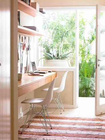
I have been working on my home office since I moved into this house. It has gone through a number of transformations to include several different wall colors, several different window coverings, several different desks and a multitude of other furniture pieces constantly in rotation. The flooring has gone from carpet to hardwood, to 3 area rugs to no area rugs and back again. Lighting has been varied to include random thrift store lamps I purchased on an impulse and, one of my better purchases, a pair of matching lucite lamps that I’m still using today. Artwork has been, in a word, “sad” however, I am proud of the brief stint my 2008 Stendig calendar spent gracing the walls. ( If I only now had space for a 4 foot by 3 foot calendar. I miss that thing. ) For the most part, try as I might, my office has generally been very haphazard and I have to say, tragically dull.
30 Jan
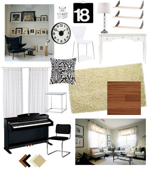
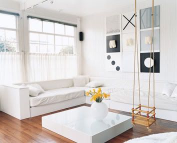
Window coverings: Also white. Big, voluminous, cotton white, puddling to the floor, set off by classic black hardware.
Desk: Oh dear. I will spare the long story and cut to the chase by saying that I finally decided to take the old vanity from my adolescent bedroom and re-paint it….white. Yup. More white. Can’t get enough of it.
Overall color scheme: White, Black, Cream and other Soft Neutrals, Brazillian Cherry wood floors, Chrome metal accents. I haven’t decided on a true “color” yet for accenting but I expect that my artwork will dictate this eventually.
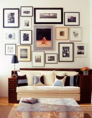
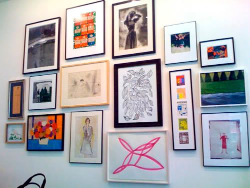
Artwork: And speaking of….I’m planning on highlighting one corner of the office with floor-to-ceiling art hung in a salon-style grouping. I’m intending the artwork to consist of a lot of bright, primary colors with white mattes and light colored or white frames. There will probably be a sprinkling of b/w photography in there.
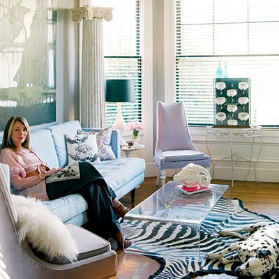
Floor coverings: I am using two rugs. One small, 3 x 5 black and white zebra print rug(not tacky, I swear!) to delineate the seating/reading area and a larger 5 x 8 cream shag rug to delineate the desk and piano area. Currently this “shag” rug is a simple bound carpet remnant but I will be replacing it with the real deal in the near/distant/unknown future. Even though the room is small, there is still plenty of cherry wood floor peeking through.
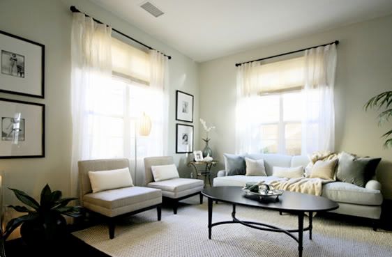
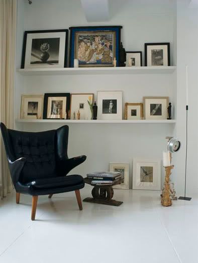
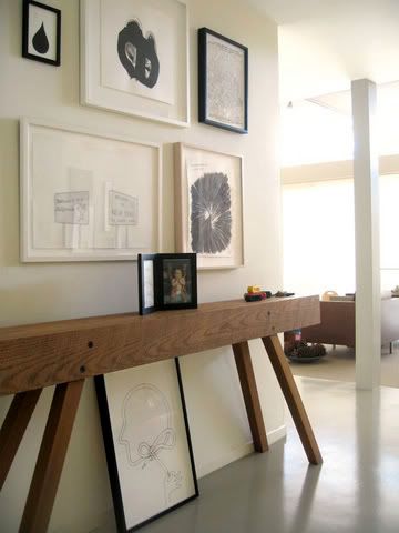
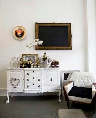
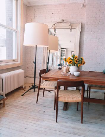
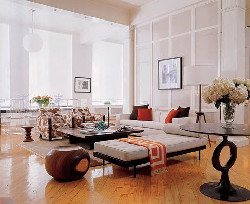
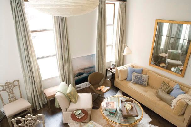
10 Mar
College dorm room syndrome
Now imagine all of those elements up on one wall at the same time. Where is the harmony and cohesion in that? Let’s face it: There’s nothing harmonious about it. It just doesn’t wok or coincide with a well designed space.
Grandma’s house syndrome
Think about it. What’s particularly inspiring about these kinds of photos if everybody has them? Nothing! And how does that contribute in the process of making your space personal? It does the opposite! Eliminate all the clutter by keeping the multitudes of these standard, posed photos (that everyone has!) in albums. There’s nothing wrong with annual school pictures but they don’t really have a place in the décor of your home.
So here’s how to remedy both of these problems:
10 Mar
Nothing makes you feel more cramped in your living space than clutter and confusion. Follow our tips to help you minimize the mess and tidy up your space.
1. Add shelves above doorways.
2. Banish room-darkening shadows with additional light fixtures.
3. Put glass shelves across deep-set windows.
4. Use a chest or an ottoman with storage inside as a coffee table.
5. Put low bookcases along a sofa back: they’ll double as a sofa table.
6. Keep the flooring throughout a small space the same for visual continuity.
7. Line a room with a shelf high up on the wall.
8. Keep window treatments simple.
9. Run a low bookcase underneath windows.
10. Stretch your space to the outdoors by making a patio or deck comfortable and welcoming.
11. Place a large bucket for magazines next to your favourite chair.
12. Line a hallway with bookshelves.
13. Use a wicker hamper as both an end table and storage space for blankets.
14. Buy a coffee table with a drawer for remotes.
15. Carve out shallow display space between wall studs.
16. Use fewer, larger pieces of furniture and accessories to reduce visual clutter.
17. Choose sofas and chairs with plain or textured upholstery rather than vibrant prints.
18. Install shelves around a window.
19. Add window seats with lids.
20. Run shelves up to the ceiling.
21. Buy a magazine rack or stack magazines in flat-bottom baskets underneath a console or coffee table.
22. Take advantage of wasted space with corner bookcases.
23. Think monochromatic.
24. Eliminate obstructions: the further you can see into and through a space, the larger it’ll seem.
25. Arrange furnishings to avoid blocking views of windows and doors.
By Margot Bolin and Jessica Cote, StyleAtTheHome.com