Archive | Inspiration RSS feed for this section

30 for 30 Reeeeeemix

4 Jan

30 for 30. Have you heard of it? Well, I am very very late in the game as I have only just discovered it a few weeks ago. 30 for 30 is a fashion challenge created by fashion blogger Kendi of Kendi Everyday. The concept is simple. Don’t go shopping for 30 days. Instead, pick out 30 items from your closet (and no more!) and remix the heck out of them to create a different outfit every day for….you guessed it, 30 days (or thereabouts). The 30 items can be any combination of tops, skirts, pants, jeans, sweaters, jackets, shoes and so on. Things like tights, belts, scarves and other accessories are freebies. (Thank the lawed!)

After Kendi first introduced the challenge last April, there have been scads of other bloggers following suit. The last challenge of the year just finished up mid-December. It’s probably a good thing I didn’t know about this sooner because I would have just moped around complaining about my very limited and fairly unstylish maternity wardrobe. I, apparently, I wasn’t all that keen on making an effort or rather spending the dough to make an effort.

Now that I no longer have a gigantic belly to contend with, I’m eager to take this challenge on for myself. Before I got pregnant last year, my personal style had been taking a major shift and I had been excited to start the year off working on thoughtfully overhauling my closet. I had found some sweet after-Christmas deals and finally had success thrifting a bunch of new items I was going to introduce when-lo and behold-the pee stick (PMF*) said “yes, you’re preggo!”. That was at the beginning of February. 11 months later, I’m still looking longingly at most of those thrifted finds as I work to get rid of the rest of Finn’s baggage, i.e. baby fat. I don’t mind it. It’s fun to slowly but surely fit (read: squeeze) back into some old things. For this reason, I think I need to wait at least another month, if not two before I take the 30 for 30 challenge. After all, I haven’t even started my workout routine back up since, oh….LAST January. Yeah. We’re not going to get into that.

For now, I’m working on cleaning out my closet to get rid of everything I’ve been tight-fisting for the past 6 years. At some point you just have to say, see-ya-later-circa-2005-periwinkle-twill-jacket-from-Old Navy. After this purge, I’m not even sure I will have 30 solid items to remix but we shall see.

Go check out Kendi’s 30 for 30 remixes and see what all the fuss is about.

*By the way, I have decided to use “PMF” (pardon my french) for whenever I say something slightly off color.

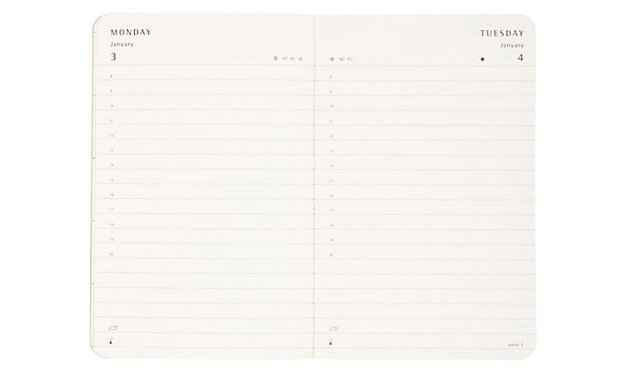
2011 Moleskine Daily Planner Set

11 Sep

How great is this 2011 Moleskine Color-a-Month Daily Planner Set???? I think I might have to order it. Or put it on my Amazon wishlist. Moleskin journals always make me think of my brother and I aspire to one day write in my notebooks as neatly as he writes in his.


Tracking our Son’s Growth

2 Aug

I’ve been thinking about how I might like to record our son’s growth in photos over his first year and I’ve boiled it down to two ideas that I’m going to go with (that I’ve totally ripped from other bloggers).

This first idea comes from Young House Love. We’ll take a monthly photo of our boy in a white onesie and lay him down on different colored/patterned backdrops for each month. Since I’m completely obsessed with patterned fabric, this is perfect. I also like YHL’s idea to simply Photoshop the month number on the onesie rather than buying already decorated onesies. Duh! And so easy to do! I LOVE this idea.

This second idea comes from Nicole at Making it Lovely. The “gimmick” for this set of photos is that we’ll be putting our boy either on the couch or in the nursery rocker next to his stuffed owl pillow (that I have yet to make) where we will be able to track his growth based on the size of the objects he is around. I like Nicole’s idea of 24 monthly photos. She uses a cute badge pin with the numbers of each month but I think I’ll print out the month numbers on small white card stock in a fabulous typeface like Archer that we’ll prop up next to him. I’d also like to find a solid colored or subtly striped onesie that I can buy in the multiple sizes needed until he is 2 years old.

Thank you to the wonderful bloggers who’s ideas I am “borrowing”!!! Mom, Dad, friends, family: “See, I do NOT come up with this stuff all by myself.”

Where do I get my inspiration?

6 Feb

My interest in home design and decor has been developing at a rapid pace for almost three years now. It wasn’t until I got engaged in the summer of 2006 and realized that I would soon be making a home for myself and my new husband that I began exploring the world of interior design. Boy have I learned a lot since then! As I said in an earlier post, most of what I’ve learned is from trial and error and a whole lot of studying! I study everything! I study my surroundings and the interiors of all the places I frequent regularly, I study books, magazines, catalogs, design shows and decor blogs, and I study my friends and families’ homes. I take absolutely everything in. I promise you, go anywhere with me and wherever I am, I will be noting every last detail. To a fault. Because of this, I feel like I will never stop learning because I can’t help but absorb all I see. Fortunately, since I am pursuing interior decorating as a career, I will have an outlet to pour all of this learning into. Eventually.

Over the past few years I have spent hours accumulating images from the internet that are saved on my computer by the hundreds. These images go into my “Interior Design” inspiration folder and are divided up into categories. I regularly save anywhere from 10 – 30 + images weekly. I like to cycle through a handful of these images every day just to stay inspired and to get my mind working to come up with new ideas for myself and others. My primary source for these images are from other design blogs. I will put up a list of some of my favorites when I get a chance.
I also love leafing through design mags for inspiration. I’ll keep them intact for a year or so until I clip out the best images and discard the rest. (I’m determined not to have years and years worth of magazines overrunning my office.) Some of the magazines I’m subscribed to also have websites set up for additional resources. Suffice it to say, I don’t think I’ll ever run out of places to find inspiration, that’s for sure!
I recommend to anyone with an interest in home decor to study, study, study! Start rooting around for images that inspire you. Don’t think too hard about it. Even if you only like one thing in the entire photo, save it! Come back to your inspiration folder 500 images later and see if you start notice a tendency towards a particular style (or two). You will. You’ll notice similarities in the images you’ve saved and that’s how you’ll eventually be able to develop your own personal style. I even recommend keeping a folder of “hate it!” images. If you can articulate AND visualize what you DON’T like, it will save you a lot of time and money when you get around to decorating your space. Do it. Do it now! 5…4…3…2…1. Now.

Life at Home

6 Feb

I recently picked up a book called Apartment Therapy: Real Homes, Real People, Hundreds of Real Design Solutions. It’s by Maxwell-Gillingham Ryan, founder of the popular shelter blog ApartmentTherapy.com. In the introduction of this book, the author has a couple of solid things to say about the home. Listen to this….

I used to think of home was the place where we cook, eat, and sleep. I now understand it as a force that shapes our daily lives. More than just a physical shelter, the home is both a second skin that protects us from the world outside, and an emotional center that nourishes us and supports our inner-most dreams.

Whether you live in a rental apartment in New York City or own a house in Seattle, your home is the one space on earth that you can call your own. You owe it to yourself to make it as beautiful, organized, and healthy as you can.

By taking care of our home, you are taking care of yourself. A healthy home will nurture and support you.


Now, I would caution myself to remember and consider that my TRUE home is not on this earth but with Jesus in eternity. No dwelling place on earth can compare to the beauty that is my future home in Glory, much as it’s hard for me to even comprehend this. But I can appreciate this quote because I think it resonates with my reasons for why I do what I do, for my home that is. Our home is a shelter, a nourishing center, a protection, and a second skin and I absolutely believe that it should be all these things. I believe this because I believe that I personally am called to live my life in and from home. Right now, I have the great privilege of being able to work from home which is something I do not take for granted. We also plan to raise a family together so being a mom will be a couple of decades worth of work that will take place primarily at home. It’s also a great possibility that my children will be educated at home. (But more on that later, much later.) I love to have people in to our home, and I want to be more hospitable to do so more often. I also, and you could say first and foremost, want my home (our home) to be a place of refuge for my dear husband. I want him to come home to a place of rest and be blessed for his hard work outside of the home.  I know that my husband could be blessed by our home even if we lived out of a cardboard box because it ultimately has to do with the homemaker’s heart and desire to serve (or her lack). But since I have been blessed with more than a cardboard box, for right now at least, I’ve been endeavoring to be the best steward I can be. 

It is a nice little balancing act between being a successful yet contented wife and homemaker and being overly consumed with my desire for creativity to flow 24/7.  Not everything creative, affordable, and possible is necessary all the time. Now that I have a blog for writing about it, maybe it will help me release some of the “overflow” of…creativity isn’t really even a good word. More like mad-scientist-insanity. 

Common Decorating Mistakes: Too Many Personal Photos

10 Mar

Note: This article is opinion based only. 
“Personal” photos don’t necessarily translate to a more “personal” space. Here’s why: Everybody does it and almost inevitably, it turns out looking like either a college dorm room or Grandma’s house.

College dorm room syndrome

  • Lots of mismatched frames such as:
  • Frames with words like “friends” or “forever”.
  • Different colored frames.
  • Beaded frames.
  • Frames with seashells or sports memorabilia. 
  • Lots of small frames. (5 x 7 or smaller)
  • Cheesy, goofy, ham-it-up type photos.
  • Blurry “spring break” type vacation photos.
  • You get the idea.

Now imagine all of those elements up on one wall at the same time. Where is the harmony and cohesion in that? Let’s face it: There’s nothing harmonious about it. It just doesn’t wok or coincide with a well designed space.

Grandma’s house syndrome

  • Again, lots of mismatched frames that are often very dated
  • Lots of posed family photos 
  • Annual school pictures
  • Traditional graduation pictures
  • Clutter, clutter, clutter

Think about it. What’s particularly inspiring about these kinds of photos if everybody has them? Nothing! And how does that contribute in the process of making your space personal? It does the opposite! Eliminate all the clutter by keeping the multitudes of these standard, posed photos (that everyone has!) in albums. There’s nothing wrong with annual school pictures but they don’t really have a place in the décor of your home.

So here’s how to remedy both of these problems:

  • Give the “Friends Forever” type frames to your teenage neighbor. They simply aren’t appropriate for anyplace BUT the dorm room or teenage bedroom because frankly, they’re juvenile. Neither is there a place for “theme” frames with palm trees or curly cues or rhinestones/beads. Give these a rest.
  • Get rid of all the small frames and replace them with bigger frames that include matte space. 
  • Repurpose any good sized colored frames by painting them one unifying, neutral color such as black, brown or white and if space allows, add a matte.
  • Stay away from mixing different styles of frames such as a modern, country cabin, and ornate traditional. There IS a way to accomplish the eclectic look, but this is not for the faint of heart. 
  • If you must have them out, keep the birthday parties, glamour shots, cheesy faces-smooshed-together-to-get-into-the-frame pictures and the like in bonus rooms like bathrooms or hallways and always have some element of your picture frames relate to one another. 
  • Maybe all the photos are black and white or maybe the frames are all black or have bright white mattes or are all the same size. This way, even if you have completely random photos, they will still feel cohesive because they will all have a common denominator: the frame/matte/size/layout.
  • You can include a few well-chosen personal photographs for your main living space but avoid overly “pose-y” shots and instead stick with more artsy or photojournalistic candids that are either similarly shot or have similar colors. 
  • Display the photos in such a way that the attention is drawn equally to both the subject of the photo and the actual frame itself. This way the overall effect is seen as “art”, not an opportunity to show off your 07′ Halloween costume or Super Bowl game face. Again, keep these kinds of shots tastefully displayed in the bonus areas of your home like hallways and bathrooms. 
  • One way to make a personal photo become a work of art is to blow the photo up, colorize it or play with the white balance to create a graphic “overexposed” effect. Just converting your photos to black and white makes a big difference.
  • If at all possible, go for frames that will allow space for a generous matte. For example, one small 4 x 6 photo placed in an 11 x 14 frame with a matte is better than putting that same photo in a 4 x 6 frame. Why? Because the frame and matte enable your eye to focus on and appreciate the photo itself instead having your eye get lost because there is no point of focus.
  • Remember, most people take more pictures than they could possibly display at any one time. Take care to ruthlessly edit the handful of photos that you want to include in your décor and put the rest in an album or an online picture sharing website.
By Brieanna Smeltz, Copyright 2008.
Open Edit.

25 Space-Saving Tips

10 Mar

Nothing makes you feel more cramped in your living space than clutter and confusion. Follow our tips to help you minimize the mess and tidy up your space.

1. Add shelves above doorways.

2. Banish room-darkening shadows with additional light fixtures.

3. Put glass shelves across deep-set windows.

4. Use a chest or an ottoman with storage inside as a coffee table.

5. Put low bookcases along a sofa back: they’ll double as a sofa table.

6. Keep the flooring throughout a small space the same for visual continuity.

7. Line a room with a shelf high up on the wall.

8. Keep window treatments simple.

9. Run a low bookcase underneath windows.

10. Stretch your space to the outdoors by making a patio or deck comfortable and welcoming.

11. Place a large bucket for magazines next to your favourite chair.

12. Line a hallway with bookshelves.

13. Use a wicker hamper as both an end table and storage space for blankets.

14. Buy a coffee table with a drawer for remotes.

15. Carve out shallow display space between wall studs.

16. Use fewer, larger pieces of furniture and accessories to reduce visual clutter.

17. Choose sofas and chairs with plain or textured upholstery rather than vibrant prints.

18. Install shelves around a window.

19. Add window seats with lids.

20. Run shelves up to the ceiling.

21. Buy a magazine rack or stack magazines in flat-bottom baskets underneath a console or coffee table.

22. Take advantage of wasted space with corner bookcases.

23. Think monochromatic.

24. Eliminate obstructions: the further you can see into and through a space, the larger it’ll seem.

25. Arrange furnishings to avoid blocking views of windows and doors.

By Margot Bolin and Jessica Cote, StyleAtTheHome.com

Top Ten Common Decorating Mistakes

10 Mar

In the 14 years that I have worked in the field of design I have been hired to consult on literally hundreds of decorating projects. Visiting clients for 2- and 3-hour consultations, I take on the challenge of suggesting major and minor improvements which might include selecting new paint colours, rearranging existing furnishings, determining future furniture purchases, re-hanging artwork, and designing appropriate window treatments. Often the suggestions highlight relatively small improvements yet I’ve seen time and again that these changes can yield incredibly satisfying results; taking rooms from “so-so” to sublime. Fortunately the most common mistakes are easy to spot and easy to remedy.

1.)

  • Don’t choose paint colors before choosing rugs or fabrics; you’ll make yourself crazy running around town with a paint chip measuring 1/2″ x 1/2″ in search of fabric that “matches”.
  • Do select one or more of the room’s most expensive items first – usually the sofa, draperies or carpet. Then choose a paint color that enhances the look of these items and contributes to the mood you desire to create. Remember, the goal of paint is to make everything else in the room look good. Even you!

2.) 

  • Don’t hang the dining room chandelier more than 36″ to 42″ above the dining room table – unless your goal is to show off the ceiling.

Do choose a chandelier that is approximately 9″-12″ smaller than the width or diameter of the table and hang the fixture 3′ above the table, where the soft lighting is more flattering to diners.

3.) 
  • Don’t hang artwork so high that eyes and necks are strained in the process of getting a glimpse.
  • Do place artwork at eye level. The exception: a double height space may require a piece of artwork (e.g. a painted canvas, photograph or tapestry) to hang above 6′. In such case, choose a very large image or something abstract, so its presence isn’t lost at the distance.
4.)
  • Don’t frame or mat a work of art with a vibrant or unusual color from the artwork itself.
  • Do use a mat to give breathing room to the print, painting or photograph. Pure white is nearly always the best choice, though occasionally an off white or putty will work.

5.)

  • Don’t purchase small collectibles for display, since itty-bitty items lose their impact from a distance. When in doubt err on the side of too big and you won’t be sorry. This goes for furniture too!
  • Do choose fewer display pieces of a larger scale and you’ll instantly improve your style quotient.

6.)

  • Don’t ignore decorative lighting.
  • Do incorporate table lamps, sconces, lamps and library lights to create interest within a room and to draw attention to favourite collections and artworks.

7.)

  • Don’t hang a mirror in a dark corner; it only amplifies this lackluster area.
  • Do place a mirror adjacent to a sunny window or behind a smart collection that is well lit – thus amplifying a positive feature.

8.)

  • Don’t automatically paint ceilings white. White ceilings work best in modern interiors and adjacent to walls that are painted in pastel tones.
  • Do select antique an off-white or ivory for traditional interiors. Pale yellow, pink or blue are other frequently used ceiling colours. If decorative moldings are noteworthy, show them off by increasing the amount of contrast between walls and moldings.

9.)

  • Don’t purchase any piece of furniture without first measuring the space.
  • Do remember to consider the width of door openings and stairs (especially if there’s a turn) for large pieces.

10.)

  • Don’t “chicken out” and settle a version of the colour you love. If you try to “lighten” red, it turns pink and that may not be what you had in mind.
  • Do be brave and stick with your original vision, provided you’ve given it careful thought. If it’s a chocolate brown family room you desire, then beige will never do. Go for it!

By Kimberley Seldon, Home Envy

The Best Places to Find Color Inspiration

9 Mar

Get Outside
Nature is the most amazing place for color inspiration, since each season offers different and amazing color combinations. The warmth of the summer and fall, the cool colors of winter and the fresh hues of spring are the perfect examples of Mother Nature’s work. Color doesn’t just exist in the growth of nature, but in every aspect. A stormy sky against fall leaves is unbelievable, while a yellow rain jacket on a gray, rainy day is the perfect color combination for spring.

Go Shopping
Take a look at the fresh produce aisles at your grocery store. Nature went crazy with the most amazing and vibrant colors of fruits and vegetables. Grab a few of your favorite shades and see how you can make them work together in your home.
When walking through the mall, take note of the clothes on the racks. Also, pay attention to the interiors of the actual stores and the color choices they used to create their atmosphere. Don’t forget to check out your favorite home stores. Vases, dishware, rugs, pillows and artwork are huge sources of color information.

Read the Fine Print
My greatest color inspiration comes from fashion and magazines. First, it’s the best way to stay on top of color trends and styles, since fashion is always the forefront of what then comes into interiors. If you see interesting color combinations on the runway or in a European magazine, they’re sure to be in your favorite home store in the near future.

Take a Stroll
Getting inspired by color can also come from being in the midst of the city. Look at the materials used on buildings and how color affects the feel of the architecture. Check out the sidewalks and roads, which use various colors of gray and black combined with pops of white and yellow of the lines on the road. Translating this palette creates a surprisingly sophisticated interior.

All the colors you see in everyday life can be a part of your home. Carry a camera to take snapshots whenever you find the perfect combination. If you see something in a store that inspires you, pick it up and make it a part of your home.

By David Bromstad, HGTV.com

10 Tips to Find Your Style

7 Mar

Multiples. Do you have multiple items of the same color, shape, or style around your house? This is one big “tell” I look for as I look through clients’ home. A kilim rug in the front hall, a kilim rug in the bedroom, another one in the living room? That means that you like Kilim rugs! It sounds way too simple to be that easy, but most people stop seeing their style even when it’s right in front of them.

Form over function. Do you work on a desk that is too small, but can’t bear to replace it? Have a couch that is crazy uncomfortable, but it’s still in you living room after all these years? That broken clock that’s still up on the wall? Take a good long look, because this is a dead giveaway to your personal style. There is something you love so much about this piece that you have chosen its form over your need for function.
Where you shop. Do you browse the same store all the time, even when you’re not looking to buy? Does a good flea market make you heart pound with excitement? Where you look for your furnishings speaks volumes about your style. New, used, found, handed down from family; where your furniture comes from represents your style!
Art. What you have chosen to hang on your walls says something about you. Art is purely personal, not tied to function or need and therefore is usually the best indication of your style. A vintage movie poster means you probably like classic lines in furniture, while an abstract lithograph likely means that modern design is your bag. Flea market oil painting of someone else’s relative? Eclectic is your style.
Most recent purchase. A French country dish towel that caught your eye in the store, or an impulse buy of a Tiffany-style lamp that you thought you’d never like, but do. The last thing you bought for your home is a fantastic indicator of what your style is, especially if it is design departure for you.
What unites your stuff? Do you have terra-cottas, rusts and warm yellows all around your house? These are the sun-kissed colors of Mediterranean design, so you should look for rough-hewn wood tables, terra-cotta lamps and vases to polish up your style. Does all your furniture have lean, sharp lines, and you don’t have a single thing on your mantel? Your style is thoroughly modern. Whether it’s color, scale, shape or era, the uniting element in your home is the best place to start when looking for your style.
What’s your favorite hotel? This is my secret weapon in finding a client’s design style! Always stay in cozy country B&Bs? Like the modern city high-rise hotel? Or do you go more for the traditionally furnished places? Hotels have clear design styles, so use them to help you find YOUR style.
Odd man out. When there is one piece different from everything else in your room, take note! Chances are, this is one style you like, but are afraid to fully venture into.
Travel. Where you chose to spend your vacations, and what you bring back with you are great style indicators. Always go to Mexico on your holidays and have a full set of cobalt-blue wine glasses? You like the hacienda look. Love your family vacations at the beach, and have jars of seashells in your bathroom? Coastal cottage is your style.
Best room in the house. What’s your most fave room in your home? Look to your best design work and repeat it! There is nothing wrong with having all your rooms designed similarly. In fact, it can bring a calm and serene feel to your house.
By Karen McAloon, HGTV.com