Archive by Author

AT Good Questions: Which Light Fixture for My Living Room

9 Feb

I want to say a big thank you to the Apartment Therapy community! They helped us out with some clarity for our living room light situation. Despite having a very low quality photo, I sent our question over and got plenty of feedback in return. A lot of people felt that the Le Klint 172 would work well while most people thought that we shouldn’t have any pendant lighting at all!! A few people agreed with us about the PH 5 pendant being a good mixture of our table lamps and our dining room pendant.. (I still love it and wish I could use it somewhere.) You can read their comments here, if you want.

So after talking it over with my husband, we feel like we don’t want to clutter the room up with any hanging light fixtures. :*-( Especially since we (temporarily) forgot that we had, ahem, 3 hanging lanterns over the TV armoire. Duh. No more hanging stuff. 
Instead, we’re considering the industrial look of this satin nickel track spot light from Ikea. (So much better looking in person, by the way.) It’s the right scale, would be a welcome deviation from the hanging spheres everywhere else, and is a whole lot cheaper than any of the other options. Plus, the spotlights can be angled any which way so as to avoid that yucky downlight effect. That’s not to say that I won’t try to fit the Le Klint light somewhere…. Nursery, anyone? 

Where do I get my inspiration?

6 Feb

My interest in home design and decor has been developing at a rapid pace for almost three years now. It wasn’t until I got engaged in the summer of 2006 and realized that I would soon be making a home for myself and my new husband that I began exploring the world of interior design. Boy have I learned a lot since then! As I said in an earlier post, most of what I’ve learned is from trial and error and a whole lot of studying! I study everything! I study my surroundings and the interiors of all the places I frequent regularly, I study books, magazines, catalogs, design shows and decor blogs, and I study my friends and families’ homes. I take absolutely everything in. I promise you, go anywhere with me and wherever I am, I will be noting every last detail. To a fault. Because of this, I feel like I will never stop learning because I can’t help but absorb all I see. Fortunately, since I am pursuing interior decorating as a career, I will have an outlet to pour all of this learning into. Eventually.

Over the past few years I have spent hours accumulating images from the internet that are saved on my computer by the hundreds. These images go into my “Interior Design” inspiration folder and are divided up into categories. I regularly save anywhere from 10 – 30 + images weekly. I like to cycle through a handful of these images every day just to stay inspired and to get my mind working to come up with new ideas for myself and others. My primary source for these images are from other design blogs. I will put up a list of some of my favorites when I get a chance.
I also love leafing through design mags for inspiration. I’ll keep them intact for a year or so until I clip out the best images and discard the rest. (I’m determined not to have years and years worth of magazines overrunning my office.) Some of the magazines I’m subscribed to also have websites set up for additional resources. Suffice it to say, I don’t think I’ll ever run out of places to find inspiration, that’s for sure!
I recommend to anyone with an interest in home decor to study, study, study! Start rooting around for images that inspire you. Don’t think too hard about it. Even if you only like one thing in the entire photo, save it! Come back to your inspiration folder 500 images later and see if you start notice a tendency towards a particular style (or two). You will. You’ll notice similarities in the images you’ve saved and that’s how you’ll eventually be able to develop your own personal style. I even recommend keeping a folder of “hate it!” images. If you can articulate AND visualize what you DON’T like, it will save you a lot of time and money when you get around to decorating your space. Do it. Do it now! 5…4…3…2…1. Now.

Life at Home

6 Feb

I recently picked up a book called Apartment Therapy: Real Homes, Real People, Hundreds of Real Design Solutions. It’s by Maxwell-Gillingham Ryan, founder of the popular shelter blog ApartmentTherapy.com. In the introduction of this book, the author has a couple of solid things to say about the home. Listen to this….

I used to think of home was the place where we cook, eat, and sleep. I now understand it as a force that shapes our daily lives. More than just a physical shelter, the home is both a second skin that protects us from the world outside, and an emotional center that nourishes us and supports our inner-most dreams.

Whether you live in a rental apartment in New York City or own a house in Seattle, your home is the one space on earth that you can call your own. You owe it to yourself to make it as beautiful, organized, and healthy as you can.

By taking care of our home, you are taking care of yourself. A healthy home will nurture and support you.


Now, I would caution myself to remember and consider that my TRUE home is not on this earth but with Jesus in eternity. No dwelling place on earth can compare to the beauty that is my future home in Glory, much as it’s hard for me to even comprehend this. But I can appreciate this quote because I think it resonates with my reasons for why I do what I do, for my home that is. Our home is a shelter, a nourishing center, a protection, and a second skin and I absolutely believe that it should be all these things. I believe this because I believe that I personally am called to live my life in and from home. Right now, I have the great privilege of being able to work from home which is something I do not take for granted. We also plan to raise a family together so being a mom will be a couple of decades worth of work that will take place primarily at home. It’s also a great possibility that my children will be educated at home. (But more on that later, much later.) I love to have people in to our home, and I want to be more hospitable to do so more often. I also, and you could say first and foremost, want my home (our home) to be a place of refuge for my dear husband. I want him to come home to a place of rest and be blessed for his hard work outside of the home.  I know that my husband could be blessed by our home even if we lived out of a cardboard box because it ultimately has to do with the homemaker’s heart and desire to serve (or her lack). But since I have been blessed with more than a cardboard box, for right now at least, I’ve been endeavoring to be the best steward I can be. 

It is a nice little balancing act between being a successful yet contented wife and homemaker and being overly consumed with my desire for creativity to flow 24/7.  Not everything creative, affordable, and possible is necessary all the time. Now that I have a blog for writing about it, maybe it will help me release some of the “overflow” of…creativity isn’t really even a good word. More like mad-scientist-insanity. 

Ceiling Fan or Not?

6 Feb

Say the words ceiling fan and I cringe. They’re big, they’re bulky, and they’re usually hideous. *shudder* Plus, the light they cast is glaring, unflattering and pretty much bunk, especially if it’s the only source of light in a room. Ew. So when I moved into my husband’s house, switching out the ceiling fans was one of the first things we did. We went to Home Depot and picked out an attractive fan that we thought would match our new home’s decor. Then we bought three of them and put them up in our living room, office, and bedroom. That was two years ago and, well, things have changed. For one thing, our style has shifted towards a definitively more modern aesthetic. Not that we weren’t going for modern before, we just didn’t know exactly what “modern” was or, for that matter, what our style was. We’ve made many a change in our home over the past two years, as opportunity and budget would allow. We’ve also made many a mistake because of not fully understanding our own tastes. You’d think it would be common sense NOT to try and decorate your house when you don’t know what you like, but alas, we learned by doing. (I don’t necessarily recommend this, however.) Slowly but surely we are making fewer and fewer mistakes while making more assertive design decisions that are relevant and consistent with our sense of style. One such mistake, which we could only see in hindsight, was the purchase of the aforementioned ceiling fans. Don’t get me wrong, the fans would be great in the right context. In fact, they will probably stay in the bedroom and office where they’re…..getting by. But now that the living room opens up into the dining room and kitchen, the lighting/ceiling fixtures from all three “rooms” must work together and that ceiling fan definitely doesn’t work. It’s not even centered! Lame-o. We ripped that thing down months ago and we’ve been living with a few little pokey wires that are hanging down 6″ from the ceiling. Now I just have to decide if I want a ceiling fan w/a light, just a fan, or no fan and a light fixture instead.

Here are a few fans that we like:


And here are some light fixtures that we like:


Here’s a sampling of some of the current lighting in our home and our possible choices for the living room:


Notice that the mention of the practicality of a fan in Florida didn’t come up. Yeah, it would be very practical to have a ceiling fan. Some would say it’s a necessity, and believe me, this past summer we could have really used the extra help in keeping our home cool. Yikes…. But some of those lighting choices above are just too amazing to pass up. I don’t know, I think it could be worth it to endure the larger electric bill in the summer if I could have one of those lights in my LR. Let’s face it, I tend to ere on the side of form over function.

So sad…

31 Jan

My favorite shelter magazine, Domino, is shutting down. Their last issue goes out in March. What a bummer. I had just sent my check for another 1 or 2 year subscription. (can’t remember which) They will probably be sending me a sub. to another magazine but I have no idea which one. I used Christmas gift money to buy subs. to Metropolitan Home, House Beautiful, and Elle Decor but they aren’t as good as Domino in my opinion. Oh well. :-( I thought about getting a Dwell subscription too, but since I picked up over 2 years worth of back issues for $5 at a garage sale, I figure I had better go through and exhaust those before I get any new issues. I also receive (as gifts) subscriptions to Cooking Light, Bon Appetit, and Southern living.

Yeah, I like magazines. A lot.

Home Office Progress

31 Jan

The office is looking less and less embarrassing. I have done almost all I can do right now on my teeny tiny budget. I’m hoping to sell a few things on Craigslist to get a little extra cash but for now I’m content with things looking presentably unfinished. Currently, I am going through two big boxes full of picture frames that need to be painted and hung on the wall. I found all kinds of frames I haven’t seen in months, years even, so I’m happy I don’t need to go out and buy anything new. I may hit up a few thrift stores to look for a couple of jumbo frames, but other than that, I’m all set. 
Big purchases to come later this year include two upholstered slipper chairs, a wool shag rug, and a large floor lamp for reading. 


I’m tempted to get these Eames plywood lounge chairs instead of the slipper chairs because they’ll be versatile for other rooms of the house in the future. Plus they’re still ultra comfortable and are very low slung and compact for a lounge chair. (Perfect for making the ceiling look taller!) The truth is, I’m afraid once I get these chairs, they’re going to go in my living room because they’re just too amazing….


I have also been dying to get this Eames rocker. I was originally bound and determined that I would buy this chair when I got pregnant however I’m thinking it might not be the most comfortable chair for nursing. But you know what, who cares! I’d rather look at and enjoy this chair for years to come than suffer through some uncomfortable nursing sessions for what….like a year?! Ok, it’s settled. This will be my official nursery chair. Yessss!! Hey, it’s still a comfy chair (despite it’s polypropylene or fiberglass construction) just maybe not for nursing.


By the way, I love chairs. I’m collecting chairs. And I love lamps. Just not lamp shades apparently. More on that later…..

Home Office: Pt. 1

30 Jan

I have been working on my home office since I moved into this house. It has gone through a number of transformations to include several different wall colors, several different window coverings, several different desks and a multitude of other furniture pieces constantly in rotation. The flooring has gone from carpet to hardwood, to 3 area rugs to no area rugs and back again. Lighting has been varied to include random thrift store lamps I purchased on an impulse and, one of my better purchases, a pair of matching lucite lamps that I’m still using today. Artwork has been, in a word, “sad” however, I am proud of the brief stint my 2008 Stendig calendar spent gracing the walls. ( If I only now had space for a 4 foot by 3 foot calendar. I miss that thing. ) For the most part, try as I might, my office has generally been very haphazard and I have to say, tragically dull. 

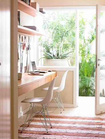
Now, that presents a problem. I cannot work in a space that is dull and lackluster. I just can’t. I try to but I inevitably end up leaving the room to work in the main living area because it’s a place I love to spend time in. It’s taken me a while to figure this out but I have found that in order for me to be the most fruitful at what I do, I must be surrounded by things that encourage my endeavors. My home office should incite inspiration and promote creativity. It should be clean and and free of unnecessary clutter. Ultimately, it should be a place where I want/enjoy/love to spend the majority of my working hours whether I am using the computer for various web and graphic design projects or teaching piano for several hours at a time. I have been working hard to  achieve this goal and as of late I’ve been getting closer and closer to it. 
The biggest dilemma I have had to deal with in the office is space planning. Trying to fit it all into what is essentially a 9 x 14 room hasn’t been too easy. More specifically,  about 9 feet of the room is 10 feet wide, and the other 5 feet of the room is 9 feet wide. Meaning that there is a 9 foot section of the wall that is inset 1 foot. Does any of that make sense? (Well, if it does, it must be said that this 1 foot of inset wall is being used as a makeshift closet i.e. I hung floor to ceiling curtains on a ceiling track in front of a pair of bookcases. This is where about 95% of the office madness is kept hidden. The room’s closet is hidden in exactly the same way with the f2c [floor to ceiling] curtains. White curtains of course.)
With all of the junk kept out of sight, I could now focus on fixing the room’s layout.  The old layout in the office was configured such that every piece of furniture was pushed up against the wall making for a big, empty, useless hole in the middle of the room. Furthermore, my desk was nowhere near a window so I was forced to sit facing away from the window with all it’s views and light and life and vibrancy and…..well, the opposite of a plain boring wall. Another problem with the space is that it became pretty much useless when the work day would end. There was no designated area for sitting, reading, listening to the piano, and generally enjoying the room, yet there was actual space going unused every day simply because I didn’t know what to do with it. I think that in an 1100 sq. ft. home, there just shouldn’t be the luxury of space “you don’t know what to do with.” If you live in a small home, you have the unique privilege of being forced to keep only what you absolutely need and love and no more. Life is simpler when you live in a space that doesn’t allow you to horde “stuff”. Oh believe me,  I still horde. I am far from perfect and my sense of organization is…well, that will be another post. But I’m learning that having junk piling up around you because you continue to buy more and more things that you don’t have a place for, well, it can be downright suffocating. All that to say, once you have whittled your things down to only the best of the best, make use of them. If you’ve gotten rid of so much stuff that you free up an entire room that will go to waste, maybe you should be living in a smaller place. That’s my philosophy anyway. Regardless of the actual size of your home, you should maximize every square inch. Adapt to your home’s size or make it adapt to you, but either way, “Waste not want not,” people.
Once I determined that my office had to be more than just an office, I began imagining how I might section the room off into different zones or almost “mini-rooms” of usability. 
I have a seating area for conversation or magazine reading, I have an office area for using the computer(laptop), and I have a studio area where the piano can be played. In addition to the seating area, I have positioned a bench in front of the closet to serve as a dressing area for when I am using the room to get ready in the morning. (My office has the big closet so I got dibs to use it for all my clothes, shoes, bags, etc. No one would know what disaster lurks behind the big white curtain. )
Office
I don’t need a large workspace. This  means the 18″ x 38″ footprint of my vanity-turned-desk fits just about perfectly in the “office” area that takes up less-than 4 foot by 2.5 foot of the room’s actual space. (This includes, desk, desk chair, trash can, printer.)
Sitting Room/Library
The seating/reading area consumes a 3′ x 7′ area of space. I am using a set of acrylic nesting tables as a coffee table. (If you don’t own at least one set of these beauties, get some NOW.)  They are invaluable as they take up absolutely no visual space and are extremely useful when you just have to have  a place to put something on but don’t want the extra clutter. 
Music Studio
The “studio” takes up 4.5′ x 4′ or 4.5′ x 2.5′ depending on whether the piano is in use or not. 
And that’s it. The room is now as balanced as I believe it can be and still feels spacious for being so filled with furniture. The biggest advantage to the new layout is that I have views out the windows regardless of where I sit and my views are of a multitude of lovely, green trees.
Had I a larger house, each of these “mini-rooms” would probably have their own individual rooms. But I am not only making do with the space I have, I am learning to, as I said, adapt to the small space lifestyle. And I have to say, from someone who grew up in in homes between 2000 and 4000 sq. ft, I love it. Just wait until we have kids…I will probably go buck wild with delight and insanity trying to problem solve that space issue. (No lie. I look forward to it eventually.)

Home Office Pt. 2

30 Jan

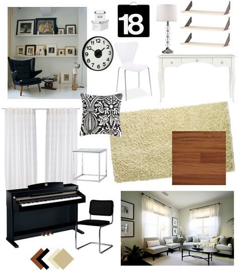
Now it’s time to focus on the fun stuff so here’s a breakdown and a preliminary mood board.


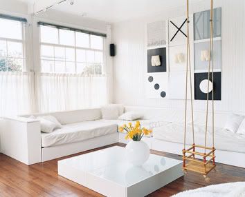
Wall color: I finally settled on….white. Yes that’s right, white. Good ol’, plain, clean, glorious white. (This is coming from two previous wall colors of aqua/turquoise and dark gray.)

Window coverings: Also white. Big, voluminous, cotton white, puddling to the floor, set off by classic black hardware. 

Desk: Oh dear. I will spare the long story and cut to the chase by saying that I finally decided to take the old vanity from my adolescent bedroom and re-paint it….white. Yup. More white. Can’t get enough of it.

Overall color scheme: White, Black, Cream and other Soft Neutrals, Brazillian Cherry wood floors, Chrome metal accents. I haven’t decided on a true “color” yet for accenting but I expect that my artwork will dictate this eventually.

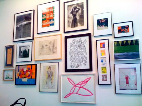
Artwork: And speaking of….I’m planning on highlighting one corner of the office with floor-to-ceiling art hung in a salon-style grouping. I’m intending the artwork to consist of a lot of bright, primary colors with white mattes and light colored or white frames. There will probably be a sprinkling of b/w photography in there. 

Floor coverings: I am using two rugs. One small, 3 x 5 black and white zebra print rug(not tacky, I swear!) to delineate the seating/reading area and a larger 5 x 8 cream shag rug to delineate the desk and piano area. Currently this “shag” rug is a simple bound carpet remnant but I will be replacing it with the real deal in the near/distant/unknown future. Even though the room is small, there is still plenty of cherry wood floor peeking through.

Overall room style:  All the black and white, the chrome, the shag rug, and the lucite tables represent a modern aesthetic. My white painted vanity with cabriole legs, my grandmother’s old painted cedar hope chest and my large ornately framed mirror have more of a vintage-y/traditional feel. 
Accessories: The accessories in the room will be a mixture of the aformentioned modern and vintage styles. Think CB2 and Anthropologie. I plan to incorporate a lot of glass, silver, mirrors, oversized sculptural pieces, fresh flowers, and natural textures.
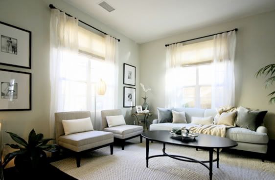
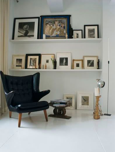
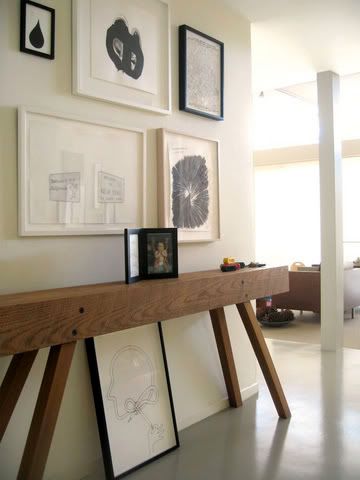
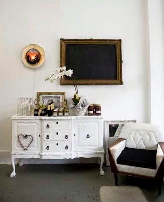
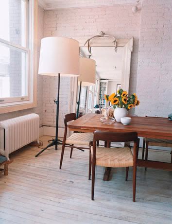
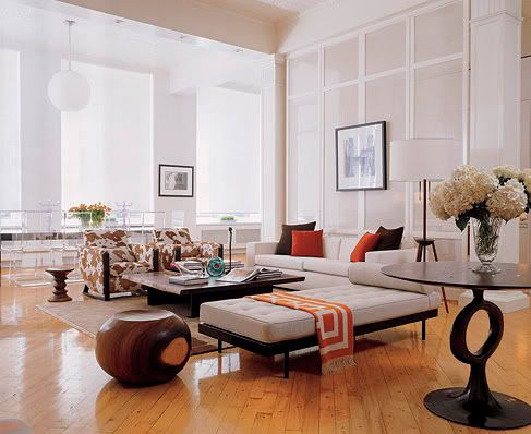
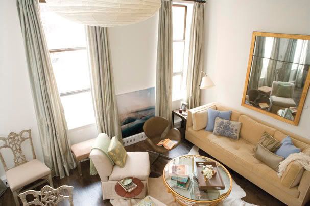
Here are a few inspiration photos:


New Year, New Goals

2 Jan

I can’t believe it’s been nearly a year since I first set out to pursue interior decorating as a business. Now, 10 months later, I have a few new ideas up my sleeve. What I tried to do last year didn’t really work out how I thought. I wanted to develop a portfolio of my work before I started charging for my services so I decided to offer my services free of charge to a handful of “clients.” While I was able to help a few people, I never ended up getting anything for my personal portfolio. As much as I enjoyed the work and was happy to help people, I found that I couldn’t afford all the time I was putting in without getting anything in return. I did gain a lot of experience however and for that I am glad. 

One of the problems I ran into was that my clients weren’t always as willing to make changes as they thought they’d be. I would present ideas and suggestions to them that they just couldn’t visualize and were therefore reluctant to try them. This is understandable because I did not present them with a compilation of all my ideas in one place. Rather, we would work on one piece at a time, getting hung up on wondering how the piece would fit with everything else. Bad idea, I know. It doesn’t make sense for me to expect people to see my brilliantly fabulous ideas if they’re all stuck in my head. :-)

This year, my approach will be different in that I will be providing my clients with the ability to purchase a personalized design plan with detailed instructions they can implement on their own. The design plan will include:

Paint Colors
Flooring
Furniture
Window Coverings
Rugs
Lighting
Textiles
Accessories
and more….

Stay tuned as I get a few things ready to post over the next couple of weeks. Until then….

Common Decorating Mistakes: Too Many Personal Photos

10 Mar

Note: This article is opinion based only. 
“Personal” photos don’t necessarily translate to a more “personal” space. Here’s why: Everybody does it and almost inevitably, it turns out looking like either a college dorm room or Grandma’s house.

College dorm room syndrome

  • Lots of mismatched frames such as:
  • Frames with words like “friends” or “forever”.
  • Different colored frames.
  • Beaded frames.
  • Frames with seashells or sports memorabilia. 
  • Lots of small frames. (5 x 7 or smaller)
  • Cheesy, goofy, ham-it-up type photos.
  • Blurry “spring break” type vacation photos.
  • You get the idea.

Now imagine all of those elements up on one wall at the same time. Where is the harmony and cohesion in that? Let’s face it: There’s nothing harmonious about it. It just doesn’t wok or coincide with a well designed space.

Grandma’s house syndrome

  • Again, lots of mismatched frames that are often very dated
  • Lots of posed family photos 
  • Annual school pictures
  • Traditional graduation pictures
  • Clutter, clutter, clutter

Think about it. What’s particularly inspiring about these kinds of photos if everybody has them? Nothing! And how does that contribute in the process of making your space personal? It does the opposite! Eliminate all the clutter by keeping the multitudes of these standard, posed photos (that everyone has!) in albums. There’s nothing wrong with annual school pictures but they don’t really have a place in the décor of your home.

So here’s how to remedy both of these problems:

  • Give the “Friends Forever” type frames to your teenage neighbor. They simply aren’t appropriate for anyplace BUT the dorm room or teenage bedroom because frankly, they’re juvenile. Neither is there a place for “theme” frames with palm trees or curly cues or rhinestones/beads. Give these a rest.
  • Get rid of all the small frames and replace them with bigger frames that include matte space. 
  • Repurpose any good sized colored frames by painting them one unifying, neutral color such as black, brown or white and if space allows, add a matte.
  • Stay away from mixing different styles of frames such as a modern, country cabin, and ornate traditional. There IS a way to accomplish the eclectic look, but this is not for the faint of heart. 
  • If you must have them out, keep the birthday parties, glamour shots, cheesy faces-smooshed-together-to-get-into-the-frame pictures and the like in bonus rooms like bathrooms or hallways and always have some element of your picture frames relate to one another. 
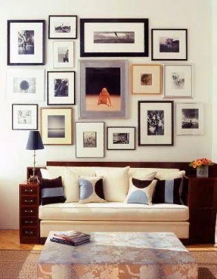
  • Maybe all the photos are black and white or maybe the frames are all black or have bright white mattes or are all the same size. This way, even if you have completely random photos, they will still feel cohesive because they will all have a common denominator: the frame/matte/size/layout.
  • You can include a few well-chosen personal photographs for your main living space but avoid overly “pose-y” shots and instead stick with more artsy or photojournalistic candids that are either similarly shot or have similar colors. 
  • Display the photos in such a way that the attention is drawn equally to both the subject of the photo and the actual frame itself. This way the overall effect is seen as “art”, not an opportunity to show off your 07′ Halloween costume or Super Bowl game face. Again, keep these kinds of shots tastefully displayed in the bonus areas of your home like hallways and bathrooms. 
  • One way to make a personal photo become a work of art is to blow the photo up, colorize it or play with the white balance to create a graphic “overexposed” effect. Just converting your photos to black and white makes a big difference.
  • If at all possible, go for frames that will allow space for a generous matte. For example, one small 4 x 6 photo placed in an 11 x 14 frame with a matte is better than putting that same photo in a 4 x 6 frame. Why? Because the frame and matte enable your eye to focus on and appreciate the photo itself instead having your eye get lost because there is no point of focus.
  • Remember, most people take more pictures than they could possibly display at any one time. Take care to ruthlessly edit the handful of photos that you want to include in your décor and put the rest in an album or an online picture sharing website.
By Brieanna Smeltz, Copyright 2008.
Open Edit.